【Python】绘制热力图seaborn.heatmap,cmap设置颜色的参数 |
您所在的位置:网站首页 › matplotlib colormap内置颜色代码 › 【Python】绘制热力图seaborn.heatmap,cmap设置颜色的参数 |
【Python】绘制热力图seaborn.heatmap,cmap设置颜色的参数
|
1. 参数详解
seaborn.heatmap seaborn.heatmap(data, vmin=None, vmax=None, cmap=None, center=None, robust=False, annot=None, fmt='.2g', annotkws=None, linewidths=0, linecolor='white', cbar=True, cbarkws=None, cbar_ax=None, square=False, ax=None, xticklabels=True, yticklabels=True, mask=None, **kwargs) data:矩阵数据集,可以使numpy的数组(array),如果是pandas的dataframe,则df的index/column信息会分别对应到heatmap的columns和rowsvmax,vmin, 图例中最大值和最小值的显示值,没有该参数时默认不显示linewidths,热力图矩阵之间的间隔大小cmap,热力图颜色ax,绘制图的坐标轴,否则使用当前活动的坐标轴。annot,annotate的缩写,annot默认为False,当annot为True时,在heatmap中每个方格写入数据。annot_kws,当annot为True时,可设置各个参数,包括大小,颜色,加粗,斜体字等: sns.heatmap(x, annot=True, ax=ax2, annot_kws={'size':9,'weight':'bold', 'color':'blue'}) fmt,格式设置,决定annot注释的数字格式,小数点后几位等;cbar : 是否画一个颜色条cbar_kws : 颜色条的参数,关键字同 fig.colorbar,可以参考:matplotlib自定义colorbar颜色条-以及matplotlib中的内置色条。 mask,遮罩 使用时有两个小技巧, (1)先用sns.set(font_scale)修改字体比例: sns.set(font_scale=1.5)(2)再用plt.rc对全图字体进行统一修改: plt.rc('font',family='Times New Roman',size=12) 2. 颜色效果cmap的参数如下: Accent, Accent_r, Blues, Blues_r, BrBG, BrBG_r, BuGn, BuGn_r, BuPu, BuPu_r, CMRmap, CMRmap_r, Dark2, Dark2_r, GnBu(绿到蓝), GnBu_r, Greens, Greens_r, Greys, Greys_r, OrRd(橘色到红色), OrRd_r, Oranges, Oranges_r, PRGn, PRGn_r, Paired, Paired_r, Pastel1, Pastel1_r, Pastel2, Pastel2_r, PiYG, PiYG_r, PuBu, PuBuGn, PuBuGn_r, PuBu_r, PuOr, PuOr_r, PuRd, PuRd_r, Purples, Purples_r, RdBu, RdBu_r, RdGy, RdGy_r, RdPu, RdPu_r, RdYlBu, RdYlBu_r, RdYlGn, RdYlGn_r, Reds, Reds_r, Set1, Set1_r, Set2, Set2_r, Set3, Set3_r, Spectral, Spectral_r, Wistia(蓝绿黄), Wistia_r, YlGn, YlGnBu, YlGnBu_r, YlGn_r, YlOrBr, YlOrBr_r, YlOrRd(红橙黄), YlOrRd_r, afmhot, afmhot_r, autumn, autumn_r, binary, binary_r, bone, bone_r, brg, brg_r, bwr, bwr_r, cividis, cividis_r, cool, cool_r, coolwarm(蓝到红), coolwarm_r, copper(铜色), copper_r, cubehelix, cubehelix_r, flag, flag_r, gist_earth, gist_earth_r, gist_gray, gist_gray_r, gist_heat, gist_heat_r, gist_ncar, gist_ncar_r, gist_rainbow, gist_rainbow_r, gist_stern, gist_stern_r, gist_yarg, gist_yarg_r, gnuplot, gnuplot2, gnuplot2_r, gnuplot_r, gray, gray_r, hot, hot_r(红黄), hsv, hsv_r, icefire, icefire_r, inferno, inferno_r, jet, jet_r, magma, magma_r, mako, mako_r, nipy_spectral, nipy_spectral_r, ocean, ocean_r, pink, pink_r, plasma, plasma_r, prism, prism_r, rainbow, rainbow_r, rocket, rocket_r, seismic, seismic_r, spring, spring_r, summer (黄到绿), summer_r (绿到黄), tab10, tab10_r, tab20, tab20_r, tab20b, tab20b_r, tab20c, tab20c_r, terrain, terrain_r, twilight, twilight_r, twilight_shifted, twilight_shifted_r, viridis, viridis_r, vlag, vlag_r, winter, winter_r 示范如下: cmap="YlGnBu":数字越大,颜色越深
cmap="YlGnBu_r":数字越大,颜色越浅
cmap="hot_r":红色到黄色,数字越大,颜色越深
cmap="OrRd":深红色到浅红色,类似“Oranges”。
cmap="autumn":黄色到红色
cmap="greens":绿色,数字越大,颜色越深 cmap="viridis":黄到蓝
cmap="greys":灰色
cmap="Purples":紫色 cmap="rainbow":彩虹色
cmap="gist_rainbow":彩虹色
将colormap置于特定值的中心(参考链接): >>> ax = sns.heatmap(flights, center=flights.loc["January", 1955]) 使用遮罩绘制矩阵中的一部分 >>> corr = np.corrcoef(np.random.randn(10, 200)) >>> mask = np.zeros_like(corr) >>> mask[np.triu_indices_from(mask)] = True >>> with sns.axes_style("white"): ... ax = sns.heatmap(corr, mask=mask, vmax=.3, square=True)np.zeros_like() 返回一个零数组,其形状和类型与给定的数组相同; np.triu_indices_from(mask) 返回数组上三角形的索引。
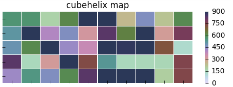
以下是一些网络上发现的配色好看的图: 原文链接: https://www.php.cn/python-tutorials-391565.html # cmap用cubehelix map颜色 cmap = sns.cubehelix_palette(start = 1.5, rot = 3, gamma=0.8, as_cmap = True) sns.heatmap(pt, linewidths = 0.05, ax = ax1, vmax=900, vmin=0, cmap=cmap)
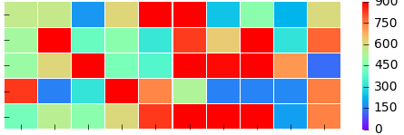
# cmap用matplotlib colormap sns.heatmap(pt, linewidths = 0.05, ax = ax2, vmax=900, vmin=0, cmap='rainbow')
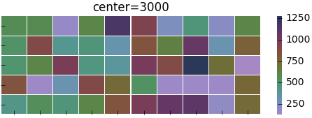
#center的用法(颜色) f, (ax1,ax2) = plt.subplots(figsize = (6, 4),nrows=2) cmap = sns.cubehelix_palette(start = 1.5, rot = 3, gamma=0.8, as_cmap = True) sns.heatmap(pt, linewidths = 0.05, ax = ax1, cmap=cmap, center=None ) #设置x轴图例为空值ax1.set_ylabel('kind') # 当center设置小于数据的均值时,生成的图片颜色要向0值代表的颜色一段偏移 sns.heatmap(pt, linewidths = 0.05, ax = ax2, cmap=cmap, center=200)
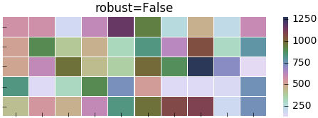
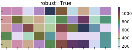
#robust的用法(颜色) f, (ax1,ax2) = plt.subplots(figsize = (6,4),nrows=2) cmap = sns.cubehelix_palette(start = 1.5, rot = 3, gamma=0.8, as_cmap = True) sns.heatmap(pt, linewidths = 0.05, ax = ax1, cmap=cmap, center=None, robust=False )
sns.heatmap(pt, linewidths = 0.05, ax = ax2, cmap=cmap, center=None, robust=True )
#mask对某些矩阵块的显示进行覆盖 p2 = sns.heatmap(pt, ax=ax2, cmap=cmap, xticklabels=True, mask=(pt |

 cmap="hot":黄色到红色,数字越大,颜色越浅


【本文地址】
今日新闻 |
推荐新闻 |